I made a theme for my Miyoo Mini Plus
I love this device, and I love thinkering with it so I made a theme for it, because why not?
So, after two weeks with this device, I still don’t write my review for it, I was going to do it today but I got some chores in the way, for now you can be happy and read Flamed’s review of it while you wait for mine! After you finish reading this short post of course.
A few days ago I wrote about making some icons for this device and a few days later they even got added to OnionOS’s themes repo!
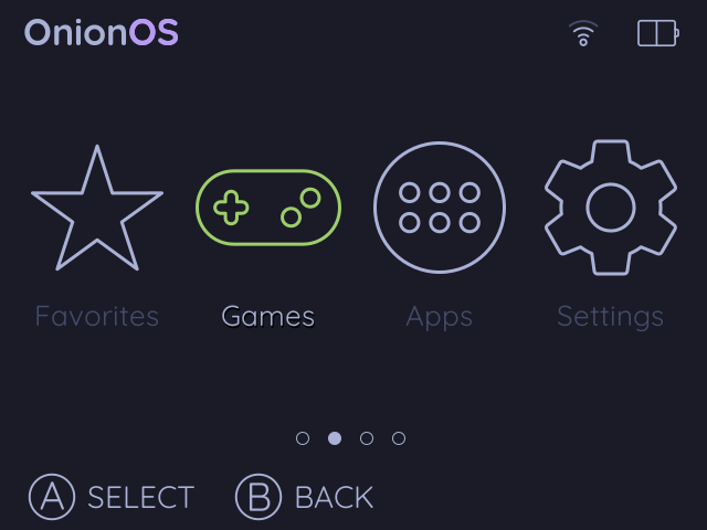
Because of this, I was inspired to keep working on a fully fledged theme for my device, which I wanted to do anyway, since nothing was quite my taste.
My favorite theme at the moment was mini.os and also Analogue but I still wanted something that actually followed the style of the Arcticons Icon Pack.
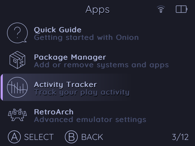
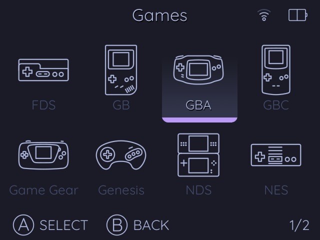
So I basically did more icons. Maybe the biggest problem was trying to keep the line thickness to be equal among the different sizes of the PNG files that represent the status icons, the main menu icons, the list icons and the like. But overall, I think I managed to strike a good balance to make it all look cohesive and minimalistic.

Of course, I also went ahead and followed the color scheme from my website! Which is the wonderful Tokyo-Night color palette.

Because of this, I had to recolor all of the icons to follow the not so white color used in Tokyo-Night, for this I used this simple function and added it to the script.
# Variable for the stroke color
STROKE_COLOR="#a9b1d6" # Change this to the desired stroke color

# Function to change stroke color in SVG files
change_stroke_color() {
    local svg_file=$1
    local color=$2
    sed -i -E "s/(stroke:)(#[0-9a-fA-F]{6}|#[0-9a-fA-F]{3})(;)/\1${color}\3/g" "$svg_file"
    sed -i -E "s/(fill:)(#[0-9a-fA-F]{6}|#[0-9a-fA-F]{3})(;)/\1${color}\3/g" "$svg_file"
}
Once those icons were dealt with, I created the rest of them on Inkscape as well. For some details, like the indicators of the focused icon or list item, I used GIMP.

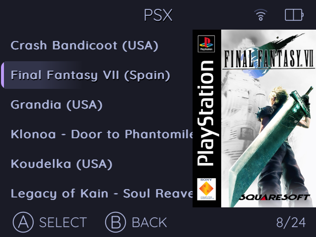
To avoid problems present in other themes, where the focused item can feel out of place alongside game covers, I decided to make the color fade to the background color, which looks rather elegant anyway, in my opinion.

Finishing thoughts
So, I am quite happy now, my theme is pretty much exactly how I want it, and that is awesome. There are still a few details I may update later in the future, but for now, I am very happy with how it turned out!
In case you want to apply it on your device, you can download it from here!
This is day 53 of #100DaysToOffload, and post 21 for #WeblogPoMo2024.
Backlinks
- Gotta theme them all on November 11, 2025
Comments
If you have something to say, leave a comment, or contact me ✉️ instead
Reply via Fediverse
You can reply on any Fediverse (Mastodon, Pleroma, etc.) client by pasting this URL into the search field of your client:
https://fosstodon.org/@joel/112533745609174891


